Main Spotlight: Connecting, Innovating, and Sustaining a Healthy Main Street Movement
Key takeaways from six sessions at the 2025 Main Street Now Conference.
Aprenda soluciones basadas en datos para retos complejos en el Taller de Transformación Comunitaria 2025 en Columbia y Hartsville, Carolina del Sur, del 13al15 de octubre.
Más información
Marion, Iowa © Tasha Sams
We work in collaboration with thousands of local partners and grassroots leaders across the nation who share our commitment to advancing shared prosperity, creating resilient economies, and improving quality of life.

Emporia, Kansas © Emporia Main Street
Made up of small towns, mid-sized communities, and urban commercial districts, the thousands of organizations, individuals, volunteers, and local leaders that make up Main Street America™ represent the broad diversity that makes this country so unique.

Chicago, Illinois © Main Street America
Looking for strategies and tools to support you in your work? Delve into the Main Street Resource Center and explore a wide range of resources including our extensive Knowledge Hub, professional development opportunities, field service offerings, advocacy support, and more!

Waterloo, Iowa © Main Street Waterloo
Your one-stop-shop for all the latest stories, news, events, and opportunities – including grants and funding programs – across Main Street.

Kendall Whittier — Tulsa, Oklahoma © Kendall Whittier Main Street
Join us in our work to advance shared prosperity, create strong economies, and improve quality of life in downtowns and neighborhood commercial districts.

Signs. We need them. They’re essential to how we get to, through and out of downtown. They direct us, alert us, and inform us. A lot of signs are necessary to make a downtown work well, but not every community knows what a good sign system looks like, or how instrumental it can be to the creation of a successful downtown. Why are sign design guidelines so essential to the success of a downtown? Because too many signs, along with signs that are produced without design parameters, create visual chaos. And visual chaos increases the likelihood that visitors won’t read many or any of them -- our brains simply bypass signs when it takes too much time and energy to make sense of them. With all the stimuli we are subjected to while traversing a downtown, it’s important that signs do their work.
There are two main categories of signs in a downtown. Those the city, village, or township erects, and those the businesses put on the buildings in which they occupy space. If you are trying to create some sign design guidelines in your community, or, if you are trying to win the sign design battle with existing merchants, start by looking at your existing signs.

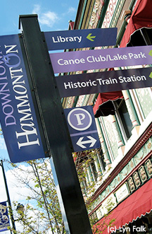
Community Signage - What kinds of signs do pedestrians, bicyclists and auto-drivers see when they first enter your city limits? What signs are directing visitors to public buildings, sites and parking lots? What about parking signs, street signs, street mall signs, and other necessary signage? Take photos of all of them and analyze them side-by-side. How do they reflect the community’s ‘brand’? How well do they coordinate with one another? Are they easy to read? Do they have unifying elements, i.e.: color, font, material, or shape?
Compare your signs with those of a community that has a successful sign system in place. What design elements tie them all together? Why is their system successful?
The key to an effective sign program is the consistent use of design elements. Signs serve to attract attention in a subtle but effective manner. You can actually train the visitor to quickly read and understand signage when the design elements are properly used.
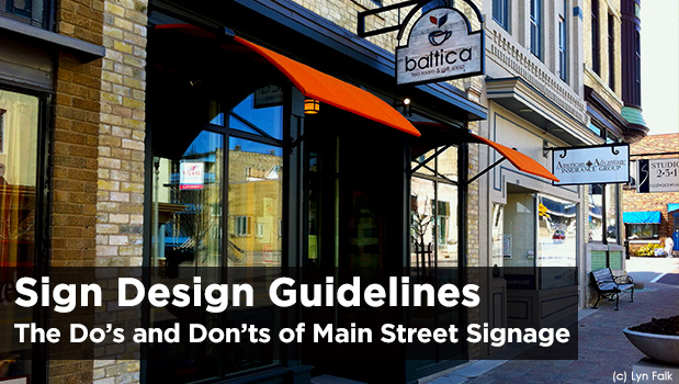
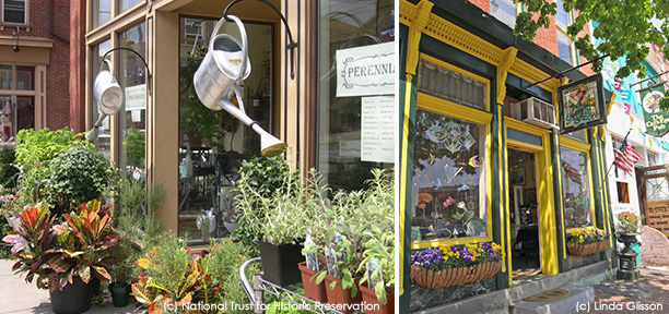
Business Signs - Take a walk down your Main Street and identify those signs that work well – ones that reflect the essence of the business’s brand, yet are in scale with their façades. Note the signs that share some common denominator with the other business signs, i.e.: sign holder, form of illumination, location on the building.
Not every business owner is capable of designing an attractive storefront sign that works with the size and scale of the building on which it hangs. In communities across America, there are stubborn entrepreneurs (who we love and help make the country what it is!) who want to create a sign that simply meets their needs. They don’t want anyone, especially not a jurisdiction, telling them what to do and not to do with their signs. I understand both sides of this equation, but ultimately, the most optimal solution for increasing business downtown (which helps everyone) is to have some set of guidelines, assuming they allow for some degree of flexibility.

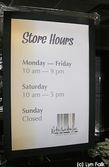
In addition to the business names, take into account the other signs posted on doors and windows, i.e.: store hours, promotions, menus, and social media icons. All of this information is important to the marketing of the business, and if done well can add to the professional look of the storefront and the community. On the other hand, too many signs, or hand written, crooked, outdated and/or faded signs taped to the windows, all detract from the business and add to visual pollution on the street. Add in community posters promoting all the good doings and happenings going on around town...and you’ve got what we call in the design industry, ‘sign creep’. Over time the windows and storefronts become a repository of information, new, old and outdated.
As a Main Street Director, you can provide merchants with non-mandatory guidelines for making their storefronts look better, explaining that less equals more when it comes to signage. Pedestrians usually don’t stop to read a lot of signs, especially if weather is cold or inclement. Simple signs are more effective as pedestrians can quickly absorb the information as they pass by. Suggest to storefront merchants to put certain information in specific locations to train visitors to look for it there. For instance, store hours and website address belong on the door, and community posters should be installed in the bottom right of a display window. Pedestrians willsoon know where to look for this type of information on each storefront. Of course not every façade can accommodate these suggestions due to differing building designs, but many can.
Ideally, all businesses on Main Street should have signs that are tastefully illuminated and on a timer, scheduled to go off after the last restaurant or theatre is closed. (The same goes for window displays.) The idea is to create a safe and vibrant streetscape even after some of the businesses have closed for the day.
Review the Design Guidelines annually. Do you need to add or subtract a category? Change design criteria? Communicate with merchants?
Conduct a sign audit every year. Even with all the checks and balances in place, ‘sign creep’ can and does occur.

Do use few words. Customers will not read a lot. They are bombarded with visual symbols and design elements every second they are on the street. Keeping signs simple is the way to attract attention and impart information. Try using fewer words and more symbols, photos, and graphic images to communicate messages.
Don’t put handwritten signs on storefronts unless it’s a chalkboard menu for a café that changes its menu daily. More often than not, handwritten signs take away from the professional look of a business.
Don’t tape signs to windows. This cheapens the image of the business and often the signs end up misaligned, or the tape stays on the window long after the sign has been removed. Instead, put the signs in acrylic sign holders with suction cups. It creates a more professional look.
Do display your logo at eye level or below for pedestrian traffic, as well as high on the façade for auto-traffic.
Lyn Falk owns Retailworks, Inc., an award-winning retail design firm based in Milwaukee, WI, and “I LOVE That Display!”, a merchandising and display division of Retailworks. For more information, visit www.retailworksinc.com, or, contact Lyn at: lfalk@retailworksinc.com or 800-379-1438. She is also a strategic partner with Redevelopment Resources, www.redevelopment-resources.com, a consulting firm that provides customized solutions for the development and redevelopment of communities.